Why a Logo Needs Room Around It
Logo clear space keeps a mark distinct from nearby text and images. Learn how to spot crowding and adjust a layout so the logo stays easy to recognize.
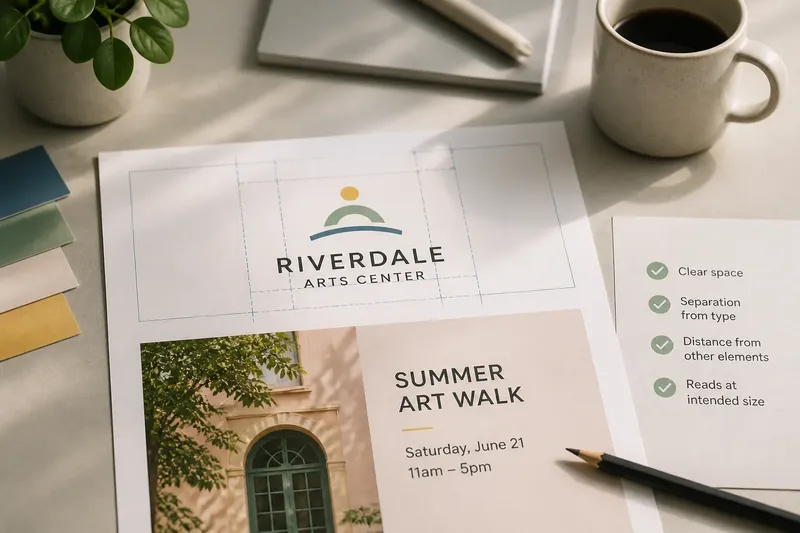
How much room does a logo need before it starts to feel crowded? Logo clear space is the open area around a mark that keeps nearby text, borders, images, and other symbols from competing with it. You can check it by examining the visible edges and seeing whether neighboring elements interrupt the logo’s shape.
That space is part of the logo’s presentation, not blank territory waiting to be filled. The mark may stay unchanged, yet a cramped placement can make it harder to recognize. A clear margin lets its shape read as one distinct unit.
Clear space is a boundary, not decoration
Design teams may call the reserved area around a logo clear space, exclusion space, or a protective zone. The terms describe a practical boundary: other content should not crowd the mark. This is different from the logo’s background. A colored panel can sit behind a logo, while clear space describes the separation between its visible edges and nearby elements.
That boundary matters when the layout gets busy. A logo may sit beside a headline, a partner mark, a photo edge, a button, or a page border. If those elements crowd its outline, viewers have to work harder to tell where the logo ends and the rest of the design begins.
Not every logo needs a large moat. The goal is not to make the mark dominate every composition. Leave enough visual distance for its parts to remain distinct and for its placement to feel intentional.
Judge the space from the visible silhouette
Start with the logo’s visible shape, not the dimensions of the file that contains it. A transparent PNG or SVG may have empty padding around the artwork. Measuring from the file’s outer edge without checking can make the margin look generous even when the visible mark sits close to nearby content.
Look at the logo as a whole. A wordmark may stretch horizontally; an emblem may have points, loops, or an irregular outline. Judge the nearest element against the closest visible part, not just the center of the mark or its rectangular frame.
- Check the visible artwork against its background for stray transparent margins.
- Inspect the closest point on the mark, especially a sharp corner or extended letterform.
- Look at both ends of a wordmark; its letters may create uneven visual edges.
- Notice whether a nearby line seems to continue the logo’s shape by accident.
Even spacing is a useful starting point, but identical gaps do not always look equally calm. A point or dense cluster can feel closer than a broad, simple edge. Use a ruler or layout guide as a reference, then judge the result at the size and in the context where people will see it.
Check every element in the logo’s neighborhood
Nearby elements include more than other logos. A page rule can seem to slice through a symbol. A headline can read as part of a wordmark if it sits too close. A high-contrast photograph can visually press against the mark even when the two do not touch.
Scan the full area around the logo:
- Type: headlines, captions, navigation labels, and legal lines.
- Graphics: rules, frames, icons, patterns, and decorative shapes.
- Images: high-contrast subjects, busy textures, and abrupt crop edges.
- Other marks: sponsors, collaborators, product badges, or social icons.
- Container edges: card borders, buttons, page trims, and colored panels.
Negative space within the logo is not the same as the clear space around it. A letter’s counter or a gap between symbol components belongs to the mark’s internal construction. The surrounding zone begins at the visible silhouette. Keeping these ideas separate helps reveal crowding instead of mistaking an open shape inside the logo for extra margin outside it.
How can you check logo clear space in a layout?
Should you measure the margin or judge it by eye?
Use any spacing rule in the identity guide as your starting point. If there is no formal rule, compare the gap with a clear feature of the mark and inspect the result at its intended display size. Measurement supports consistency; visual judgment catches awkward shapes and uneven optical weight.
Does a background panel count as clear space?
A panel can give the logo a quiet setting, but it does not automatically create separation from nearby content. Check the distance from the visible mark to the panel’s text, graphics, and edges. If the logo feels crowded inside the panel, the background color alone will not solve the problem.
How should a logo sit beside another logo?
Give each mark enough independent space to remain recognizable. Avoid letting their outlines, taglines, or distinctive shapes visually merge. A divider may help, but it should not become so prominent that it competes with either mark.
What if the logo must fit a small space?
Check whether an approved compact version is available, such as a symbol or stacked arrangement. If the available version still feels crowded, reconsider the surrounding layout or placement rather than shrinking the logo until its details become difficult to read.
Use a visual pass before the layout is finished
Check whether the logo feels separate, not merely whether a gap exists. View the layout at its intended size, then scan around the mark: top, right, bottom, and left. Look for a side where a headline, image edge, or border seems to lean into it.
Next, briefly hide the nearby content in your design app. The logo should still read as a coherent mark on its own. Restore the content and notice whether any element seems to attach itself to the logo or cut across its visual boundary. Zooming out can reveal the overall impression; zooming in can expose a line or corner that sits unexpectedly close.
Say you are placing a neighborhood arts center’s wordmark above an event caption in a flyer. The caption’s first letter sits close to the logo’s final flourish, making the shapes seem connected. Move the caption lower and away from the flourish; the expected result is a separate, readable wordmark without removing the caption or changing the information.
Try viewing the layout in grayscale, too. This can make edges, contrast, and shape easier to assess without color drawing attention elsewhere. Restore the intended colors afterward: a vivid background or photo may change how near the logo feels, even when its position has not moved.
Make room without turning every logo into a monument
Clear space protects recognition, but too much isolation can make a logo feel disconnected from the content it identifies. On a compact card, the mark may need to sit near a title to form a clear heading group. The question is whether that relationship feels deliberate and the logo’s outline remains distinct.
Do not solve crowding by automatically adding a large empty box around the mark. That can consume useful layout space and create an awkward island. Instead, adjust the nearest competing element, choose a more suitable logo arrangement, or give the mark a quieter background. The right choice depends on the identity and the layout’s purpose.
If an identity guide specifies a minimum clear area or approved variants, follow its directions. When the rules are silent, make a visual decision and apply it consistently across related pieces. A banner, social tile, and printed invitation may need different compositions, but the logo should not look pinched in one and oddly detached in another.
For a final logo clear space check, ask whether someone can trace the mark’s visible edge without getting pulled into a neighboring line, letter, image, or frame. If not, adjust the nearest element and look again at the size people will encounter. That small pause helps the logo stay legible while the rest of the layout does its own work.