The Alignment Trap: When Neatness Hides the Hierarchy
Learn how page alignment can obscure meaning, then use grouping and spacing to show readers which details belong together and where to look first.
Why can a perfectly aligned page still feel confusing? Page alignment makes edges behave, but it does not tell readers which ideas belong together. The useful question is not simply where each item lines up; it is what each item means in relation to its neighbors.
A column of evenly spaced labels, dates, captions, and headings may look orderly from across the room. Up close, a reader still has to work out which date belongs to which event, which caption explains which image, and which label applies to which block of information. The page has regularity, but its hierarchy remains hidden.
Alignment organizes edges, not meaning
Alignment is a visual relationship between edges, centers, or baselines. It can connect elements and give a page a coherent frame. A left-aligned column, for instance, gives the eye a dependable starting edge. Baseline alignment can make a row of mixed-size type feel settled.
But the eye may read alignment as a relationship even when no meaningful relationship exists. If several unrelated items share one left edge, they can appear to form one group. Conversely, if a heading and its explanation are separated by a large gap, they may look unrelated even when they describe the same subject.
This is the alignment trap: treating a consistent edge as if it were evidence of a clear structure. The page looks tidy, so the designer assumes its organization is legible. Yet readers do not decode a layout by measuring its margins. They look for cues about what belongs together and what matters first.
Group information before choosing its alignment
Begin by identifying units of meaning. A unit might be a title with a date, an image with its caption, or a service name with its hours and location. The point is not to draw boxes around every item. It is to decide which details a reader should perceive as one thought.
Once those relationships are clear, spacing can make them visible. Keep related items close enough to read as a group, then create a stronger pause before the next group. Alignment can reinforce that structure: titles might share a left edge, while each caption stays tucked near its own image. The edge helps, but proximity does the crucial semantic work.
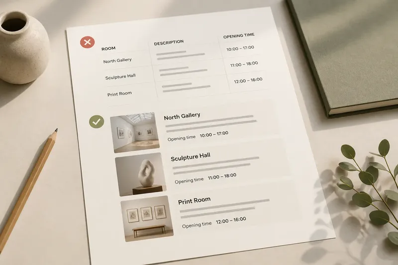
Imagine a fictional gallery handout listing three rooms, each with a room name, a short description, and an opening time. In the starting layout, the names, descriptions, and times sit in separate columns. A reader may have to scan sideways to reconnect each room with its details. The designer then moves each room’s name, description, and time into a single cluster, and aligns the three clusters along a shared edge. The expected observable result is that a reader can follow one room’s information without searching across the page; the tradeoff is a less rigid column structure.
Use proximity to show which details belong together
Proximity is a direct cue: items near one another are likely to be related. It is especially useful when a page contains repeated content, such as event listings, product cards, or directory entries. Each repeated unit needs enough internal closeness to feel connected and enough separation from its neighbors to remain distinct.
That distinction does not require equal gaps everywhere. If the space between a heading and its explanatory line is as large as the space between separate sections, the two levels can blur. A tighter gap within a group and a more generous gap between groups gives the reader a simple visual map.
Whitespace also carries structure. It is not merely leftover room after the text has been placed. A blank area can separate two subjects, create a pause before a new section, or keep a caption from drifting toward the wrong image. Before reducing a gap to make the page feel more compact, ask what relationship that space currently communicates.
Build hierarchy with more than one cue
Spacing is only one way to distinguish levels. Type size, weight, color, indentation, and position can all help readers identify a heading, supporting detail, or secondary note. The strongest layouts use cues that agree. A section title might sit above its content, appear larger than body text, and have extra space before it.
When every element receives the same treatment, nothing clearly leads. When every element receives a different treatment, the page becomes a collection of exceptions. Choose a small set of visual signals and use them consistently enough that readers can learn what they mean.
Alignment still has a role. Shared edges can unify items within a group or give several groups a common frame. But alignment should not erase useful differences. A small caption does not need to stretch across the same broad line as a headline just to satisfy a column. Nor does a label need to sit far from its value because both happen to align with the page margin.
How can you tell whether the page shows its relationships?
What should be grouped before anything is aligned?
Identify each heading and the details that explain it, along with each image and its caption. If the items form one thought, keep them together; if they describe separate subjects, give them distinct spacing or placement.
How can you tell if a gap is doing useful work?
Look at the page without reading every word and notice which areas appear connected or separate. If visual closeness links unrelated content, increase the gap; if a large gap divides one thought, bring those items closer.
Should every section begin at the same horizontal position?
Not necessarily. If readers need to compare similar sections, a shared starting edge can help; if a note is subordinate or nested, use indentation or a distinct position to show that relationship.
What if the page looks neat but still scans poorly?
Trace one piece of information from its label to its explanation, image, or action. If the eye must jump between distant regions, regroup those related elements before changing the overall grid.
Let the content decide where the grid bends
A grid is a useful set of alignments, not a command to make every item occupy the same kind of space. A long title may need a narrower measure than a short date. A caption may sit beside an image rather than beneath it. A sidebar may contain information that supports the main story without sharing its visual weight.
When a layout feels awkward, resist the reflex to force everything onto one line or into identical blocks. First ask whether the content units are correctly identified. Then decide which groups should align, which should sit closer together, and which need a distinct position to show their role.
For a quick review, cover the text with a sheet of paper or squint at the page until the words soften. Check for the major groups and notice where the eye is meant to begin. If the page offers only a tidy set of edges, alignment has organized the surface while leaving the hierarchy for the reader to invent.
Good composition does not abandon neatness; it gives neatness a job. Use page alignment to steady the layout, and let meaning determine which elements gather, separate, or take priority. When those decisions agree, readers can see the relationships instead of having to solve them.