Before the Grid: How Printers Found Order on a Page
Before the grid, printers used type, margins, columns, and repetition to organize pages. See how practical conventions became deliberate design tools.
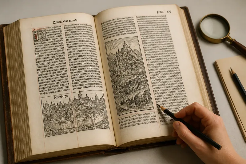
How did printers organize a page before the grid became a design tool? Before the grid, printers relied on type, paper, and repeated conventions to guide a reader’s eye. A page from the 1490 Nuremberg Chronicle, printed by Anton Koberger, makes that transition tangible: its dense blocks of text sit alongside woodcut images in a recurring arrangement, though regularity alone does not prove the printer used a modern grid.
Page order began with the work of printing
For a printer, order began with making a page printable and readable. Type had to fit within the sheet, lines had to hold together, and pages had to lead a reader through the text. Those needs encouraged recurring arrangements long before designers treated a grid as an abstract tool.
Margins gave type a boundary. Headings, larger letters, and spacing distinguished one kind of information from another. A book might use one text block, while a reference work could use columns to place related entries close together. These choices served practical needs and shaped the page’s visual character.
Consistency mattered across a sequence. Readers could learn where to look when a page number or heading appeared in a familiar place. Printers and publishers repeated such arrangements without needing a named system for every decision.
The Nuremberg Chronicle shows inherited conventions in print
Printed in Nuremberg in 1493 by Anton Koberger, the Liber Chronicarum, commonly called the Nuremberg Chronicle, combines Latin or German text with many woodcut illustrations. Its pages make a useful, specific comparison: text is arranged in columns, while images occupy places within or alongside the text area. The repeated structure helps readers distinguish visual material from prose.
That example should not be mistaken for evidence of a modern grid system. Its columns and recurring placements show that printers could organize a page systematically in practice. They do not, by themselves, establish that Koberger planned a reusable network of alignments in the later graphic-design sense.
Printing also inherited habits from manuscript production. Scribes had used margins, ruled areas, and visual hierarchy to guide reading. In print, those conventions met movable type, woodblocks, available paper, and the demands of setting and correcting pages. The medium changed; the need for a legible path did not.
Paper, binding, and type shaped the page
Movable type made repeated text possible, but each line still had to be composed from individual pieces. Column width constrained which words could fit. A change to one line could affect its neighbors, so a manageable text block served both the reader and the compositor.
Book construction mattered, too. Printers folded sheets into gatherings, then booksellers or binders trimmed and bound them. The printed area had to remain clear of the trimmed edge, while the inner margin needed to accommodate the binding. These physical demands helped establish familiar page proportions.
Margins could also leave room for notes and marks. Their size varied with a book’s format and purpose, so a broad blank edge does not always point to one design intention. It may reflect a practical allowance, a reading habit, or both.
Columns and margins became a visual grammar
Columns suited dense material that readers needed to scan. Dictionaries, schedules, and directories can benefit from short entries grouped close together. Long-form prose often works better as a single text block. The reading task helped determine the arrangement.
Repeated placement made pages easier to learn. If headings received the same treatment and page numbers appeared consistently, readers did not have to decode each page from scratch. This predictability offered a quiet form of navigation.
For printers, a column was more than a visual choice. It was a boundary for setting type and fitting content to a sheet. The same arrangement could therefore be practical in production and helpful in reading without being conceived as a formal grid.
A deliberate grid coordinates relationships
A grid becomes a deliberate design tool when a designer plans page divisions to coordinate elements. It can connect columns, alignments, spacing, images, and captions. The designer can follow the structure, bend it, or make a break from it conspicuous.
This does not make older conventions obsolete. Margins and columns remain useful; a planned grid makes their relationships explicit across a publication. A shared structure can keep recurring sections coherent while allowing photographs, headings, and notes to vary.
Order does not require a rigid grid, and a grid does not have to make a page feel stiff. The useful question is whether the arrangement helps a reader find, compare, and understand information.
How can you tell convention from a planned grid?
What features suggest a deliberate grid?
Look for several coordinated relationships, such as recurring column widths, aligned image edges, and consistent spacing between sections. A single straight edge may come from the type block rather than a planned system.
Did printers use grids before the term became common?
Printers used repeated alignments, columns, and page divisions that can resemble a grid. Those visible patterns do not prove that a printer conceived a formal, reusable grid in the later design sense.
Why do old books have margins?
Margins kept text clear of trimmed edges and bindings, framed the reading area, and sometimes left room for notes. Their proportions depended on the book’s construction and intended use.
Can a page feel coherent without a grid?
Yes. Clear hierarchy and consistent relationships can organize a page without a formal grid. A grid is especially helpful when repeated elements need to work together across many pages.
Read the page before naming its system
Imagine a museum educator preparing a handout based on a scan of the Nuremberg Chronicle. She starts with a page where text and a woodcut share the printed area. She marks the visible column edges and notes where the image interrupts the text, then compares those placements with another page. If the same relationships recur, she can describe a repeated layout convention; if the elements shift, she should avoid calling it a fixed grid. The resulting explanation distinguishes what the page visibly does from what its maker may have intended.
When examining historical page design, begin with the reader’s task: following a passage, comparing entries, finding a heading, or moving between text and image. That approach makes the difference between a useful convention and a deliberately coordinated grid easier to see—and keeps the evidence on the printed page.