Serif or Sans Serif for a Printed Field Guide?
Serif or sans serif for a printed field guide? Compare reading voice, type size, and page setting to choose a face that stays clear in the field.
Should a printed field guide use serif or sans serif type? Serif or sans serif for a printed field guide is not a vote between old-fashioned and modern; it is a decision about how the page should sound and how readers will use it. A specimen description may call for a steady, bookish voice, while a label beside a bird illustration may need to be spotted at a glance. Start with the reading situation, then compare typefaces at their actual size.
Begin with the moment a reader opens the guide
List the places and conditions in which someone will consult the book. A guide used at a desk invites sustained reading. One opened outdoors may be held at an angle, scanned while standing, or read in changeable light. The same typeface can feel comfortable in the first setting and cramped in the second.
Separate the content by task. Introductory essays and habitat notes ask readers to follow connected paragraphs. Identification keys, captions, range notes, and index entries ask them to find a particular word or fact. Those jobs do not need identical typographic treatment, even if they share a family.
- Mark which material is read continuously and which is scanned.
- Note whether readers are likely to use a table, a trail, a classroom, or another setting.
- Identify the smallest recurring text, such as a map label or caption.
- Record whether the page will often sit beside a photograph, drawing, or diagram.
These observations give you a useful brief: not “serif or sans,” but “easy paragraphs, quick labels, and a voice that suits this subject.”
Compare the voices before comparing the details
Serif letters have small finishing strokes at the ends of their main forms. In a printed guide, they can give paragraphs a measured, literary quality. That tone may suit plant descriptions, field notes, or longer passages about ecology. The effect depends on the particular face: a sturdy, open serif can feel direct, while a fine, high-contrast one can feel delicate.
Sans serif letters lack those finishing strokes. Their voice often reads as crisp and current, which can suit labels, keys, and compact reference material. But “sans serif” does not automatically mean plain or informal. A rounded face may feel friendly; a narrow, rigid one may feel technical.
Choose two or three candidates, not whole categories. For instance, compare a robust text serif with an open humanist sans serif. Set the same short passage in each, including a scientific name, a numeral, and a word with repeated narrow letters. Look at the shapes as well as the mood: are counters open, are strokes distinct, and can a reader tell similar characters apart?
Set a real page sample at the intended size
Type shown large on a screen hides the problems that appear in print. Make a representative spread in the layout software you plan to use, such as Adobe InDesign or Affinity Publisher. Include a heading, a paragraph, a caption, a key or label, and any italic text the guide needs. Use the intended paper and print method if those choices are settled.
Judge body text at the size it will occupy, not after enlarging the page view. Print a proof and read it at an ordinary distance. Check whether the letters remain distinct in a paragraph, whether lines feel crowded, and whether a caption can be found without effort. A typeface that looks elegant in a specimen may become wispy when printed small; a broad face may consume too much column width.
Size and spacing work together. If the smallest text feels pinched, try a more open face, a slightly larger setting, or more line spacing. Then check the page again: enlarging type can make a narrow column break into awkwardly short lines. Adjust the layout and type as a pair rather than treating size as a final cosmetic choice.
Match the face to the page’s setting
Think about light, posture, and pace. A reader leaning over a desk can give a dense paragraph sustained attention. Someone standing outdoors may need a short label to register quickly. Larger, well-separated labels can help in the latter situation, but simply making every heading bold can flatten the hierarchy. Let the most useful information receive the clearest emphasis.
Also consider the page’s visual surroundings. Fine serif details can sit comfortably beside detailed botanical drawings, but may compete with a busy image if the type is too delicate or small. A sans serif can bring a clean edge to a diagram, though a strongly geometric face may feel unlike the natural subject. Look at the whole spread, not a text sample detached from its illustrations.
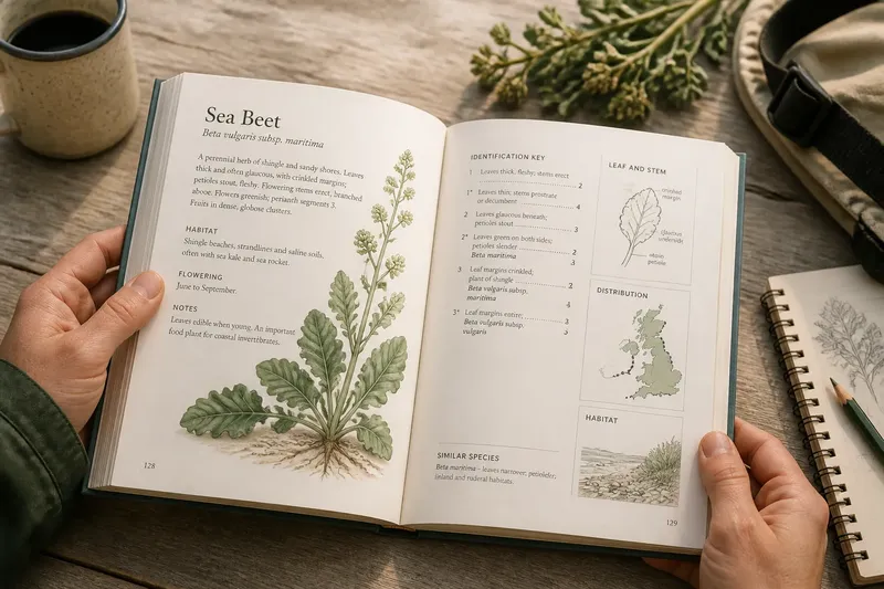
Imagine a guide to coastal plants with long habitat notes and small diagrams. You could set the notes in an open serif, then use a clear sans serif for diagram labels and the identification key. On a printed proof, the expected result is a distinct reading voice for each task, with labels easier to locate without forcing the paragraphs into a different tone.
Choose one family or combine two?
A single family can keep the pages cohesive and simplify the typographic system. Many families include enough weights and styles for headings, body copy, captions, and emphasis. Check that the italic is legible at small sizes, especially if botanical or Latin names appear often.
A serif-and-sans pairing can make different tasks easier to distinguish. Keep the roles stable: for example, serif for continuous reading and sans serif for navigation and labels. The two faces should differ enough to communicate their jobs, but not so much that the spread feels assembled from unrelated publications.
Before committing, check the font’s available weights, italics, and character coverage. A guide may need accented letters, symbols, or specialized characters. Confirm licensing and production requirements with the font provider and printer; their terms and specifications determine what is suitable for the edition.
Which type choice fits the reader’s question?
Is serif type easier to read in print?
Either category can work well in print. Letter design, size, spacing, ink, paper, and column width all affect the experience, so compare actual proofs rather than relying on a broad rule.
Should a field guide use sans serif for labels?
Sans serif often gives labels a crisp, compact appearance, but a clear serif can work too. Choose the face that remains distinct at the label’s real size and stands apart from nearby illustration details.
Can a field guide mix serif and sans serif?
Yes, when each face has a clear role and the pair feels compatible on the same spread. Reusing those roles consistently helps readers recognize paragraphs, captions, and navigation without learning a new style on every page.
What should I check on a printed proof?
Read a paragraph, scan a key, and inspect the smallest caption under ordinary viewing conditions. Look for cramped spacing, weak contrast between letter shapes, and type that disappears beside artwork.
Make the decision from the printed page
Choose the face that serves the guide’s most demanding reading task without making the other material feel out of place. If extended notes dominate, begin with a comfortable text face; if quick identification dominates, give labels and keys extra attention. A coherent serif-and-sans pairing is another sound option when it clarifies those different jobs.
Keep the proof beside the intended illustrations as you decide. For a serif or sans serif printed field guide, the best choice is the one whose voice fits the subject and whose smallest necessary text remains easy to find on the page.